Hillgreen Energy operates multiple biomass and renewable energy facilities across the UK, delivering renewable energy solutions including solar panels and biomass systems for commercial clients mainly across agricultural sectors.
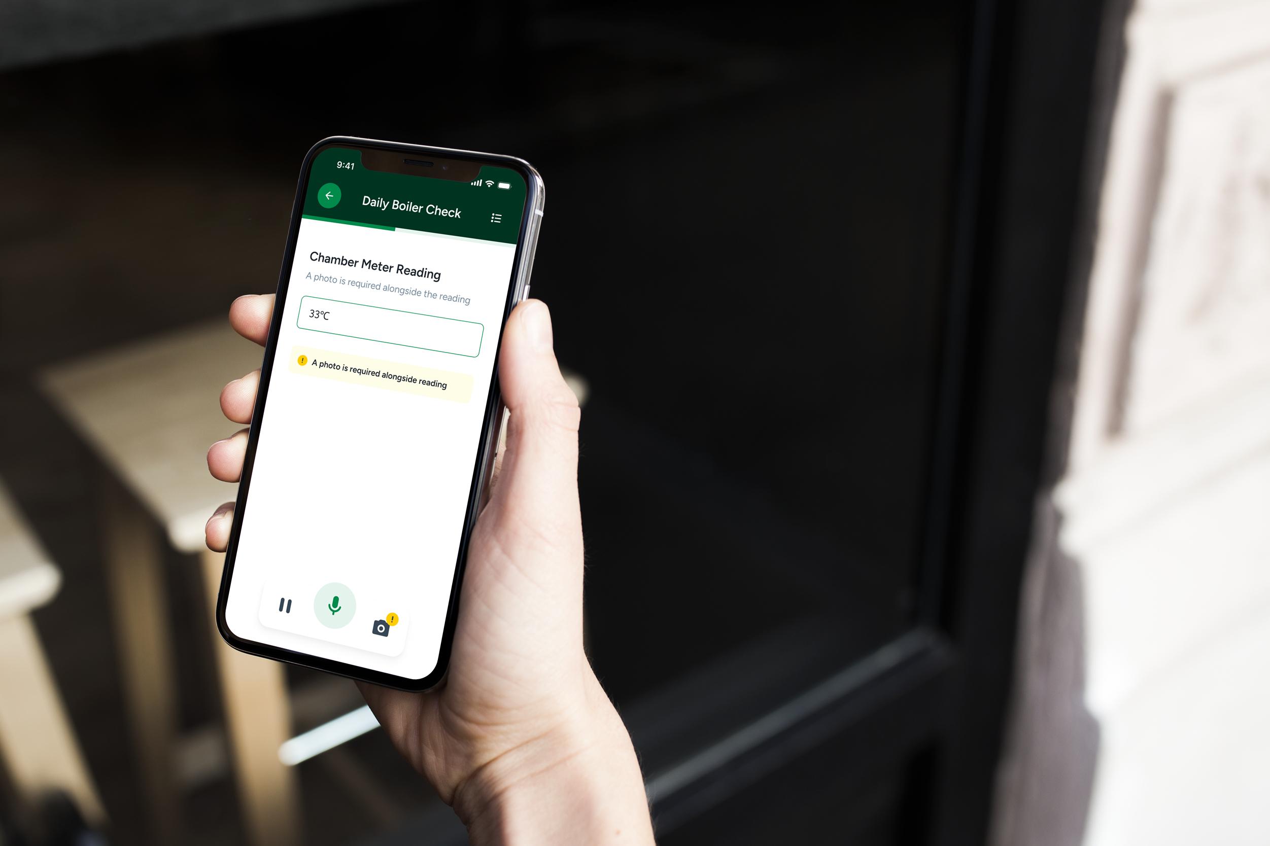
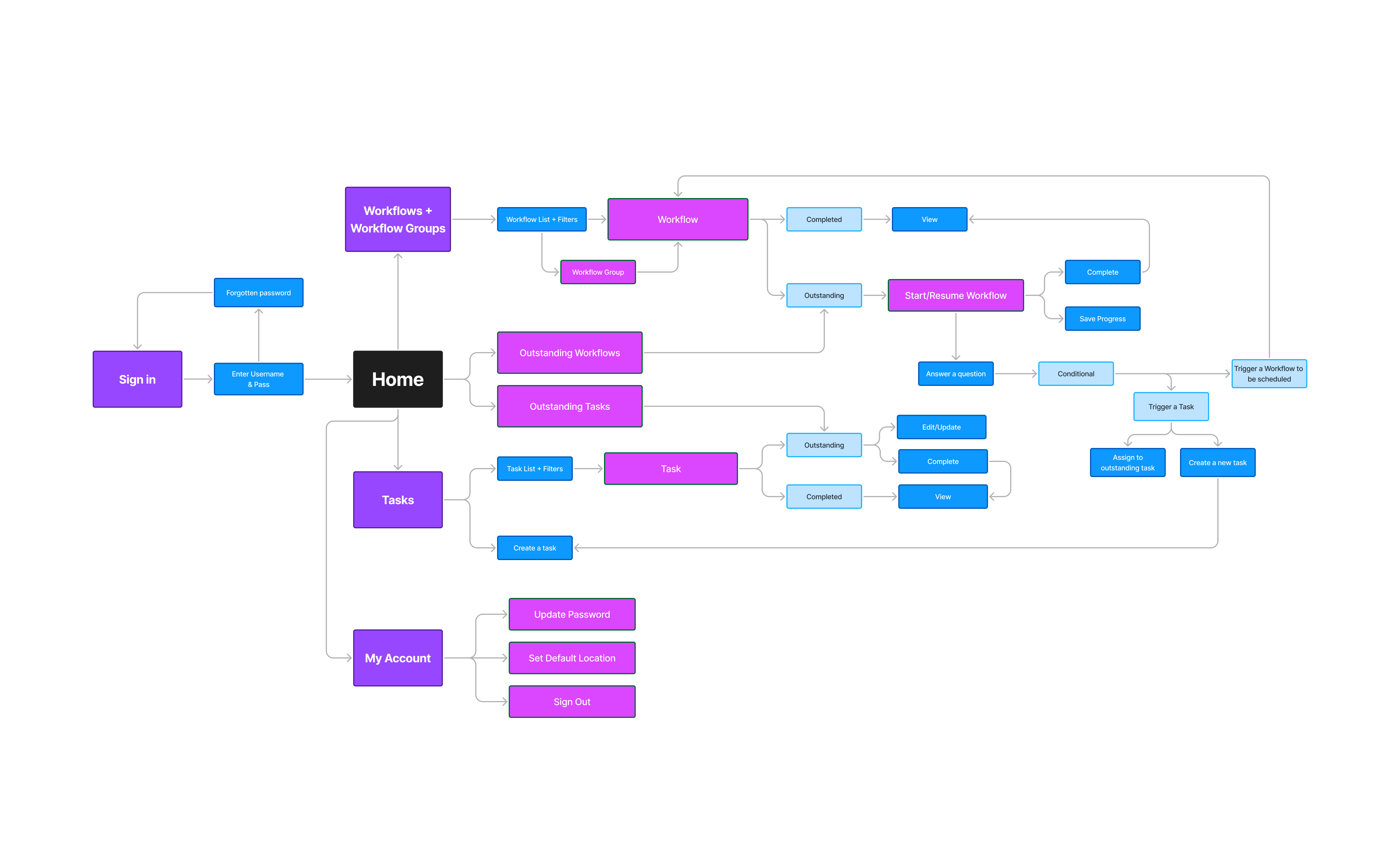
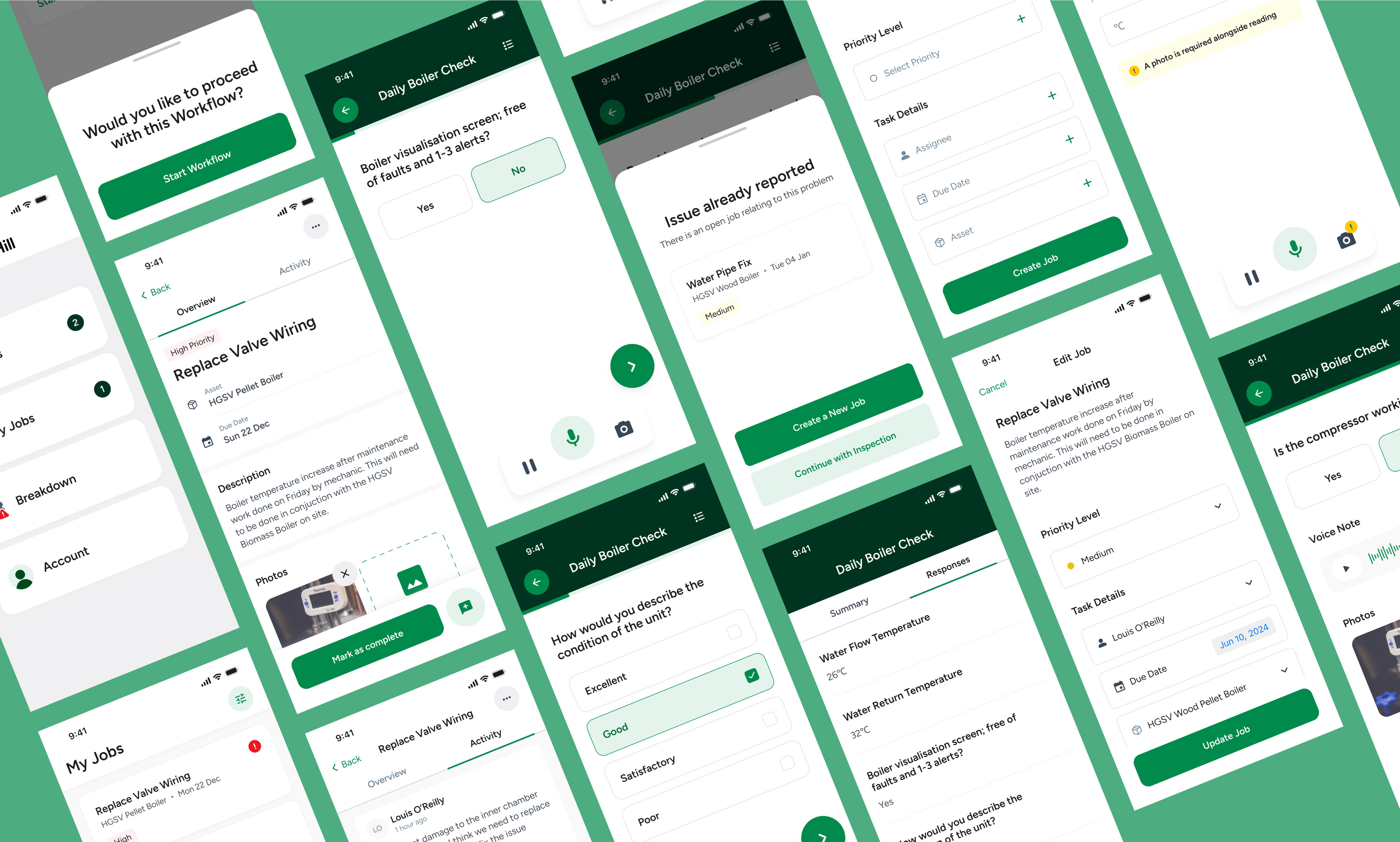
The aim of this project is to deliver a comprehensive end-to-end mobile application to assist Hillgreen Energy operators with equipment operations, maintenance and streamlining administrative and reporting functions for their operators.
Greenhill Energy operators face several key challenges that need to be addressed:
We visited 2 sites locally that operate where Hillgreen operate along with a visit to their office to interview operators, technicians and supervisors about their pain points and needs within the new solution.
We also shadowed operators whilst they completed their checks to get an insight into obstacles within the logging process, which for them felt overall quite tedious, and frankly never ending - this gave a sense of empathy of why checks mostly don’t get completed which is having a knock on to wider parts of the business operations.
An insight into responses from the interview sessions below:
Taking into account the initial requirements of the project and findings gathered from user interviews and insights of operational processes, we initially plotted out a MoSCoW chart and a refined userflow to ensure that users have everything they need within the app without it being overloaded with features
Overview of features to consider below:
After iterating a set of wireframes and creating prototypes for key flows and states of the app, we took them back to the Hillgreen site to test on the operators, displaying real tasks and check information so that we could shadow them conducting the test.
The learnings from the feedback was really insightful as it demonstrated that the overarching need for the operators was simplicity.
Our testing sessions were also most insightful as they gave us a good indication of the varying accessibility and usability needs are of the operators who will use the app on daily basis. It was clear that level of confidence (tech savi-ness if you like) in using an application such as this was of a wide contrast amongst the group, so inclusivity was at the core of the design phase.
This can be seen through implementing consistent interaction patterns across the app, with larger touch targets on buttons and cards, and using typography and iconography that is bold and clear.
The design system also factored in scalability to the admin console, but also future phases of this app, ensuring that designers and developers have a core set of components and documentation to iterate and build from.
The final design balances functionality with simplicity, incorporating user testing feedback and accessibility needs. The interface features consistent patterns, clear navigation, and large touch targets for field use.
With an accessible color system and readable typography, the app effectively addresses initial problems while remaining scalable for future updates through its modular design system.
In the first two months after launch, 93% of assigned checks were completed by operators through the app—a vast improvement over previous reporting rates. The most significant feedback has come from both users on the operator and admin sides.