Trekhound

A Comprehensive Ecommerce Solution For Premium Dog Equipment

  • UI/UX Design
  • Click Rate Optimisation
  • User Research & Analysis
01
Overview

Who are Trekhound

*Details including brand name and general branding have been adjusted to protect agreed NDA

Trekhound are the UK market leader in manufacturing and supplying high-quality gun dog training equipment to meet the needs of trainers at every level, trading to online customers across the world.

The brief for this project was to revamp their website, putting ease of use in customer buying journeys at the forefront in order to create a stronger usability experience whilst also moving the brand visually forwards in terms of their website experience.

02
The Problem

Dismantling the Digital Painpoints

The existing website faced several critical issues that prompted the need for a redesign, most importantly factoring in the clients future goals which include increasing turnover and pushing themselves into their space within the industry as an innovative market leader in the sector. Some of the key issues picked out with the current solution are bullet pointed.

  • Outdated visual design that didn’t reflect product quality and felt uncompetitive against others in the industry.
  • Navigation, search and filtering functions made the website experience feel very difficult for customers who require the need to search by ranges and brand.
  • Poor mobile responsive behaviour which was in turn affecting the growing number of mobile shoppers
  • Checkout process leading to cart abandonment, especially forTrade Customers who have to jump through extra hoops at this stage in their buying journey.
  • Limited product filtering and search capabilities frustrating customers who are looking for specific items.
  • Backend system makes over the phone orders very complex and convoluted, which created friction for customers, and in turn absorbing client time handling these transactions by other means.
03
Personas

Understanding Our Users

Before commencing with putting the pieces together that would form the foundations of the new website, it was imperative that we gathered and interrogated data presented in research to better understand the overarching needs of both existing and prospective users of this website.

In doing so, we worked in collaboration with Trekhound in a persona session, canvasing their different customer types and what their key needs and obstacles may be when it comes to interacting with a solution that they felt at ease using.

You can find a condensed view of each of the four identified personas through navigation of the carousel below.

04
User Flows

Mapping the Key Journeys

Taking into account our personas along with competitor research, we plotted out user flows for each profile, taking into account user needs from the website, and what their interaction path would look like in order to complete their desired task.

The user flow below is for Caitlin, who has come across a Trekhound sponsored ad on Instagram promoting a seasonal sale. The path illustrates on the assumption that Caitlin is in the information gathering phase, and is ascertaining a) if this is a brand she can trust and b) how she can complete her buying journey.

05
Wireframes

Formulating a new solution

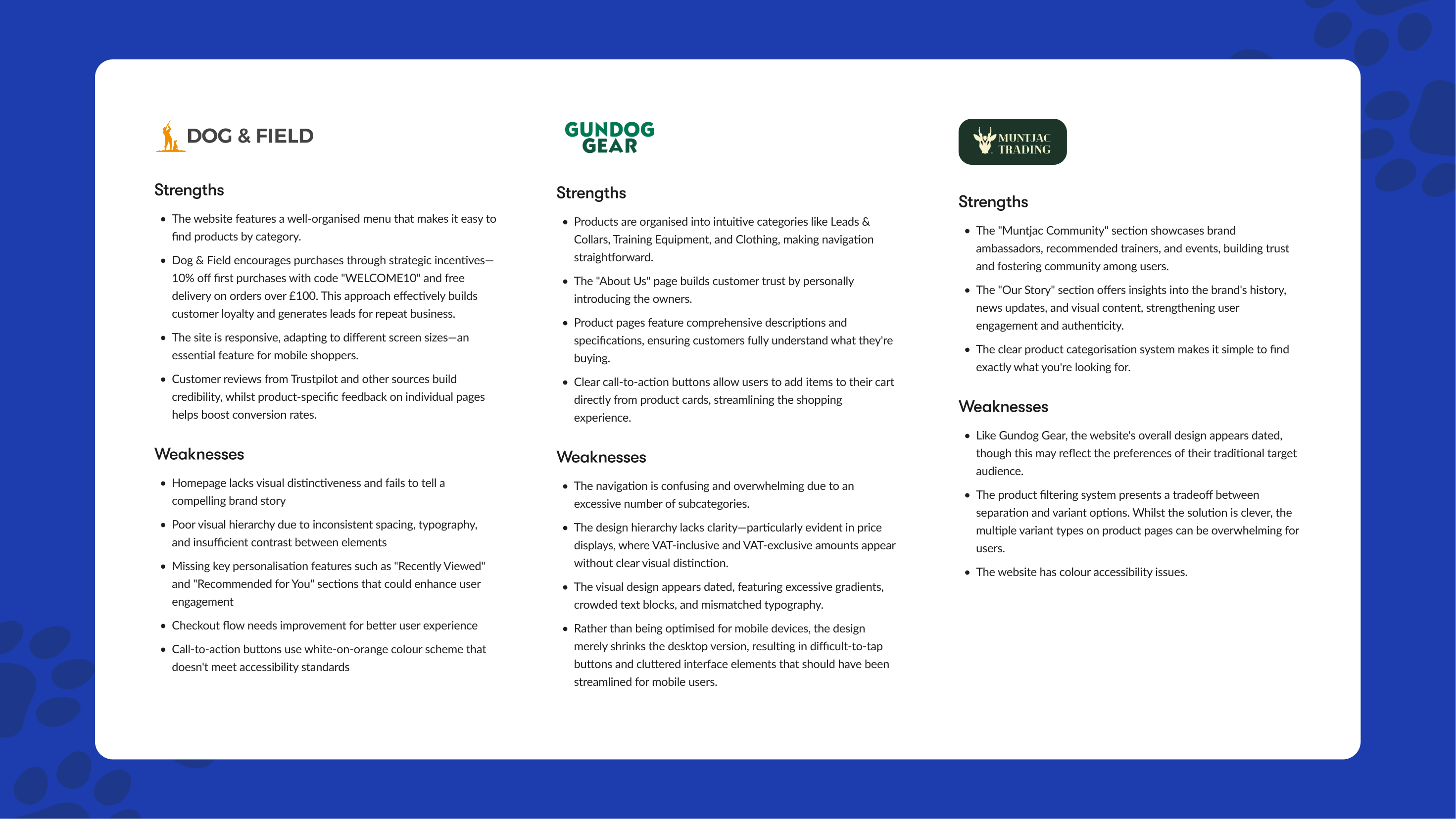
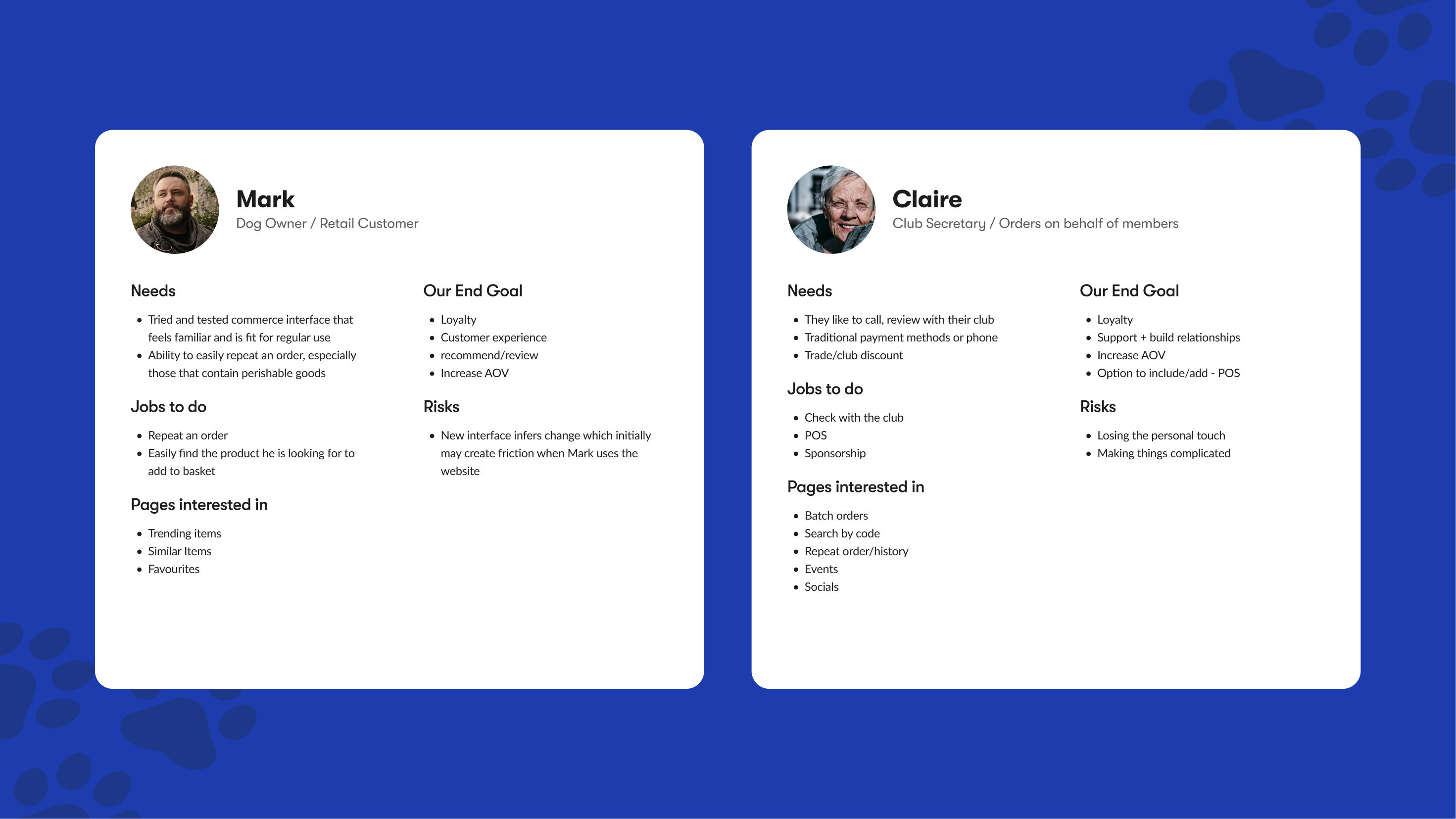
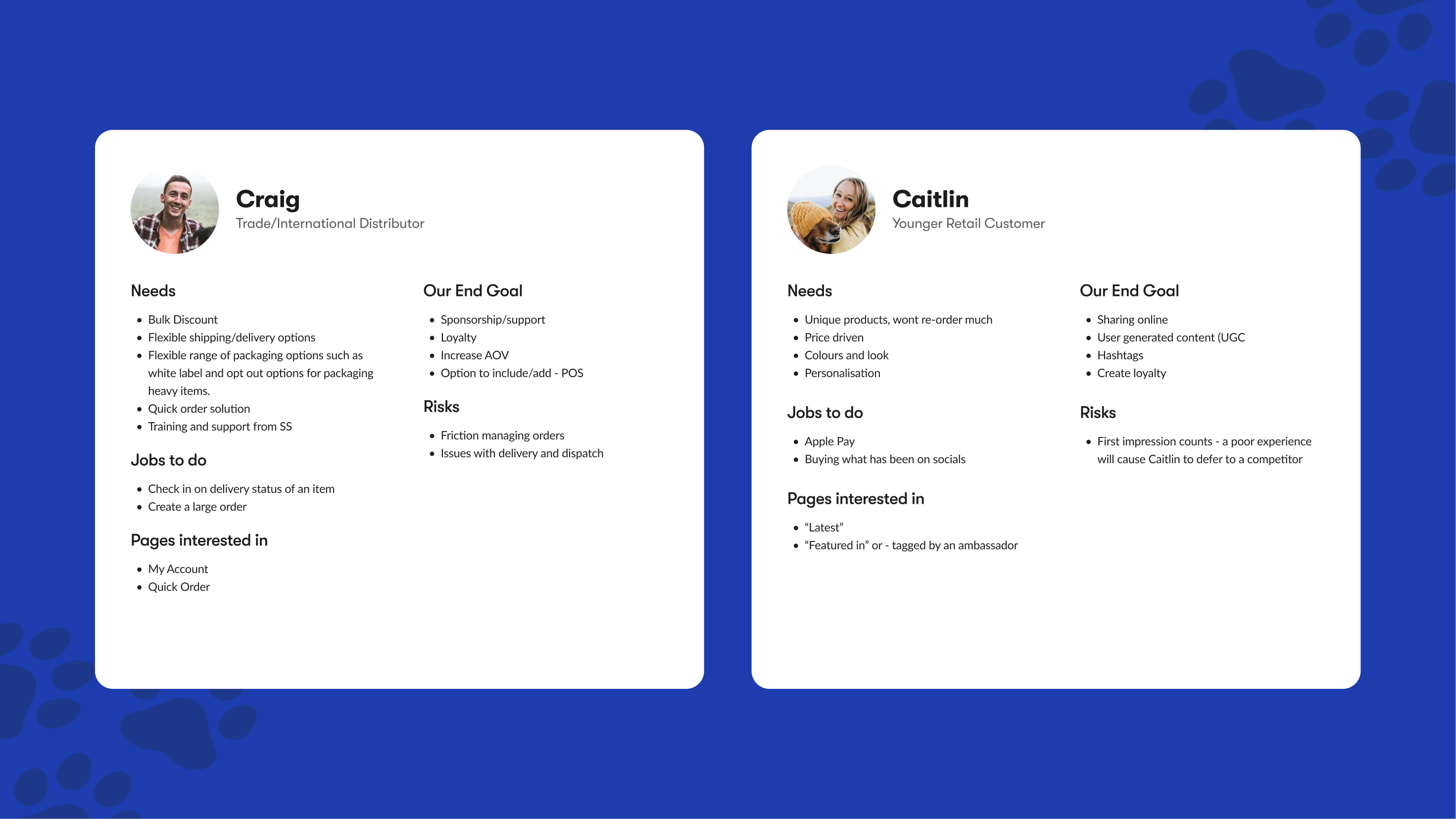
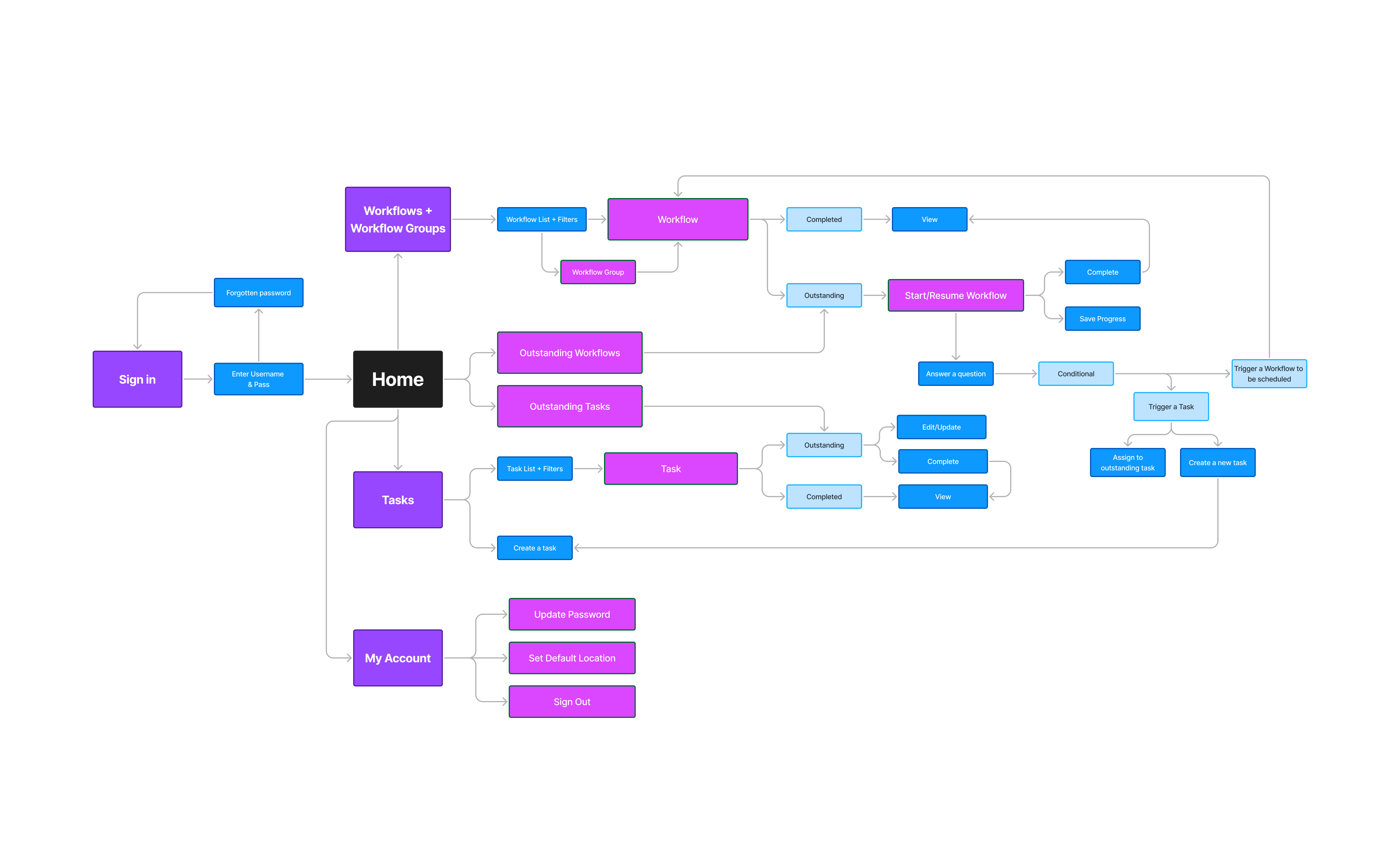
Building upon our research and persona development, I began the design process by creating a detailed sitemap. This crucial step helped establish a clear information architecture that would serve the diversity of the user groups effectively.

With the site structure defined, I moved into wireframing key pages of the website. Starting with low-fidelity sketches and progressing to more detailed wireframes, I focused on creating intuitive user flows and clear navigation paths that addressed the pain points identified in our research phase.

Throughout the wireframing process, I maintained regular communication with both internal development teams and the client, which took form in conducting review sessions to gather feedback and making iterative improvements. This collaborative approach ensured that technical feasibility, business requirements, and user needs were all carefully balanced in the final solution.

Multiple iterations of wireframes were developed and refined, with each version incorporating feedback and evolving to better serve user needs while maintaining alignment with Trekhound's business objectives.

06
Optimisations

Refining the Experience

Following our wireframing stage, we implemented design treatment and visual direction so that we could move into a testing phase. Due to budget constraints, our primary method for testing and validating design concepts relied on Miro for studying user behaviour patterns on the site. We supplemented this with targeted usability testing sessions involving both internal agency teams and client-side stakeholders, though it must be mentioned that these were limited in scope. While not as comprehensive as a full user testing program, this approach allowed us to gather valuable insights and make informed design decisions.

Through our analysis, we identified several key areas for optimisation on the product pages

  • Improved contrast to primary call to action as the one on the first iteration was losing the impact we had when a sharper colour contrast was utilised within the colour selection feature.
  • Streamlined product variation selection process with clearer size and colour options
  • Improved product image galleries with zoom functionality and factoring in scalability for instances where we don’t have multiple image variations
  • Product no. given more priority
  • Shipping and Returns taken out of tabular container and placed within a link, with ‘Free Shipping’ added to label to entice.
  • Star rating added to the main container – lack of data meant that we wouldn’t include this however we found showing 5 stars as the default for 0 reviews would be valuable to building trust then not showing anything. This would also be a helpful tool to entice users to review.
07
Design

Bringing The Vision to Life

Drawing from our extensive research, user personas, and iterative design process, we crafted a final design that speaks directly to Trekhound’s audience. The solution balances functionality with approachability, incorporating familiar e-commerce patterns whilst maintaining a warm, personable feel that resonates with their customer base.

Our design choices were carefully considered to create an experience that feels both professional and welcoming. The result is a digital presence that truly reflects Trekhound's position as a trusted provider of premium dog equipment.

You can preview a desktop view of a handful of the key page view below

08
Feedback

Project Impact & Results

The redesigned e-commerce platform has significantly improved user engagement and business performance for Trekhound. Through careful implementation of our design solutions and strategic improvements, we’ve achieved measurable success across key metrics.

43
%
Increase in mobile conversion rate after implementing responsive design improvements
27
%
Reduction in cart abandonment rate through streamlined checkout process
52
%
Growth in average order value from trade customers due to improved account features

Let's Chat

For work enquiries, or simply to say hello send me an email:
louis.oreilly97@gmail.com